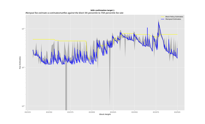
but underestimating in over a quarter of the cases would sounds a bit painful for a user that wants to only submit an initial attempt.
The times when fee rate estimates did not make it are mostly when (the time of block discovery - the time of estimate) is > 10 minutes.
As I observed, the spikes are mostly due to congestion periods.
In most cases, when the blue estimates where overestimating, it’s within the block range. However, yes, paying a lower fee rate might get the transaction in, but with high likelihood of getting bumped out.
In particular an estimate of 150 sat/vb vs 75 sat/vb (the blue spike at the end) is probably about equally bad as a 50 sat/vb vs 25 sat/vb (the yellow overestimate for a while at the beginning).
The estimate of 150 sat/vB (50th Percentile fee rate of expected block) you indicated is for block 832478.
The block 832478 after its Confirmed has 50th Percentile fee rate of 150 sat/vB, which means this estimate was accurate.
The block’s high end used to plot the point in the graph is the 75th Percentile, which is 178 sat/vB.
The block’s low end (5th Percentile) is 60 sat/vB.
The block has average fee rate of ~170 sat/vB.
We could reduce the percentile we do estimate to maybe the 25th percentile, which is 130 sat/vB in this case, but there is a likelihood of getting bumped out if the time it takes the block to confirm after we make estimate is > 10 minutes, and the weight of transactions with a mining score > 130 sat/vB that entered the mempool after we made our estimate are also > 25th Percentile of 4,000,000.
The choice of the 50th percentile is to reduce the chances of getting bumped out.
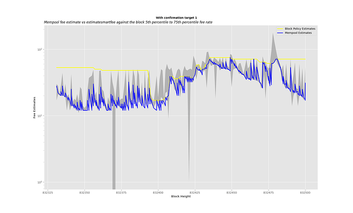
In the case of the yellow overestimations at the beginning, it is unlike the blue once because what you are paying is beyond the block fee rate ranges. (i.e you will pay for the block space more that other people are paying)
I have modified the plotting. It can now return both linear and log scales for the y-axis.
Here is how it looks now without the threshold:
plot_estimates(832331, 832500, data, logscale_yaxis=True)
Here is the graph with the threshold when y axis is in log scale:

